The look and design of your LibGuides will change depending on your audience. If you’re designing LibGuides for adults, graduate students, or advanced learners – you’ll focus more heavily on library resources, advanced searching techniques, and information literacy skill reinforcement.
When designing LibGuides for children, think bright, colorful, engaging, and entertaining.
No matter what children are doing online, whether its entertainment or education, they’re looking to have fun. Your LibGuide should be simple to use and exciting. If it’s not, you run the risk of them going elsewhere – to a webpage that can hold their short attention spans and fulfill their instant gratification needs.
So, when designing your LibGuide – dig deep and think back to when you were a child. Let’s cover a few tips for designing LibGuides for children.
1. Design for Appropriate Ages
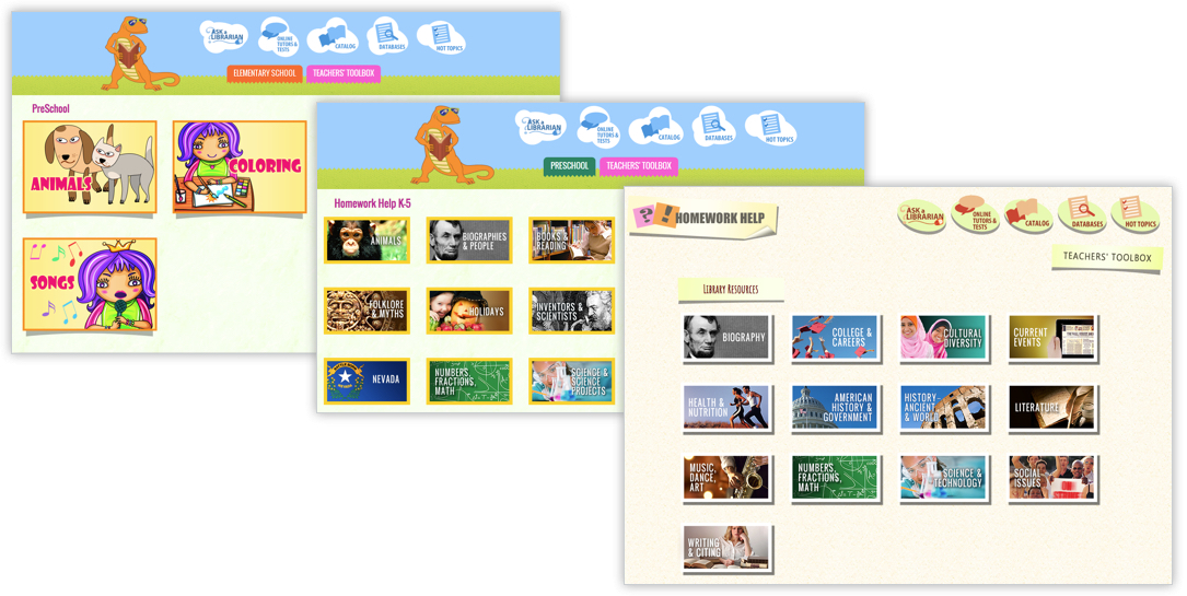
Remember when you were 12 and someone gave you a gift meant for a 7 year old?! Gasp, the horror! You’re a pre-teen, not a baby!! Well, the same principle applies to your LibGuides. One size does not fit all, so consider creating different LibGuides for each age group. Furthermore, what holds the attention of a 7year old is going to be totally different than what attracts a 10year old. Create LibGuides CMS groups to customize the look & feel of each group of guides for each age group.
Example Guides Customized by Age Group
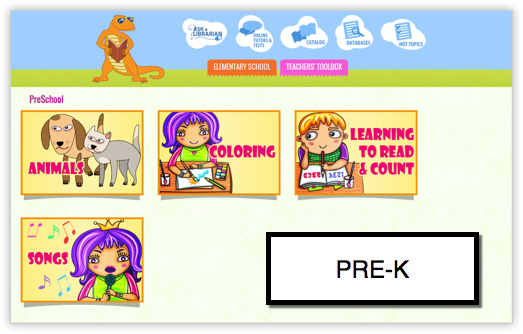
One great example that comes to mind is the Las Vegas-Clark County Library District LibGuides System. They’ve created different groups for PreK, K-5, and 6-12 age groups that all have a different look and feel.
2. Use Bright Colors & Images
Children respond to bright primary and secondary colors. Think red, blue, yellow, green, purple, and orange. Avoid muted colors and think bright saturated color schemes. Don’t skip over accessibility concerns, because if an adult can’t read purple text on a yellow background, then a child won’t be able to either.
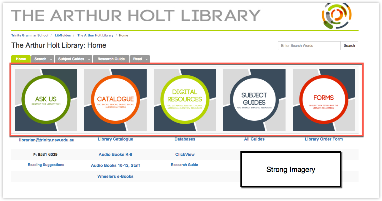
3. Use Images to Create a Call to Action
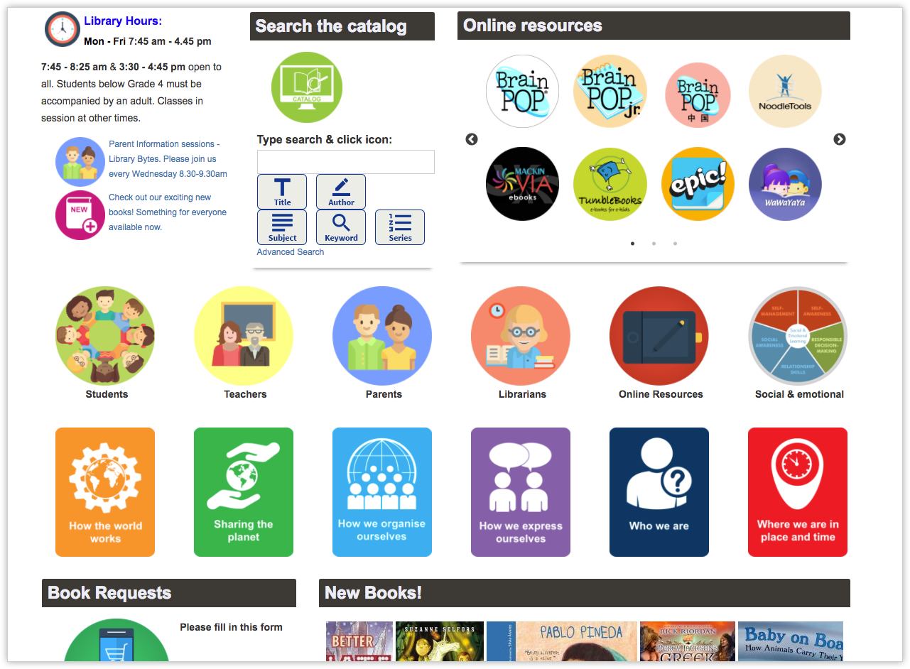
Try to avoid lots of ‘copy’ and consider using images to create a call to action. There are loads of free tools you can use to create beautiful icons, and you don’t need to be a graphic designer to use them!
Examples:
4. Incorporate Interactive Elements
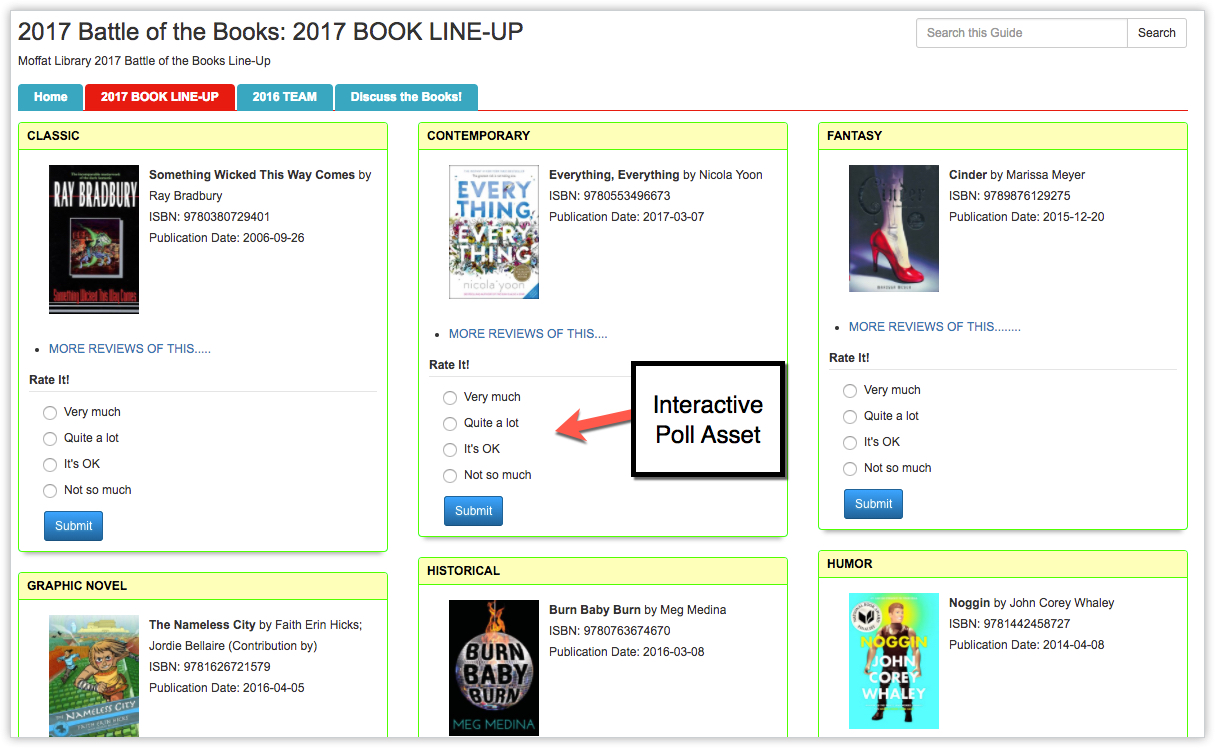
Children want to play, plain and simple. Even when they’re learning, they learn better in a game’ified environment. Consider adding interactive polls, embedded videos, interactive widgets and activities to enrich their learning experience.
5. Consider ‘Characters’
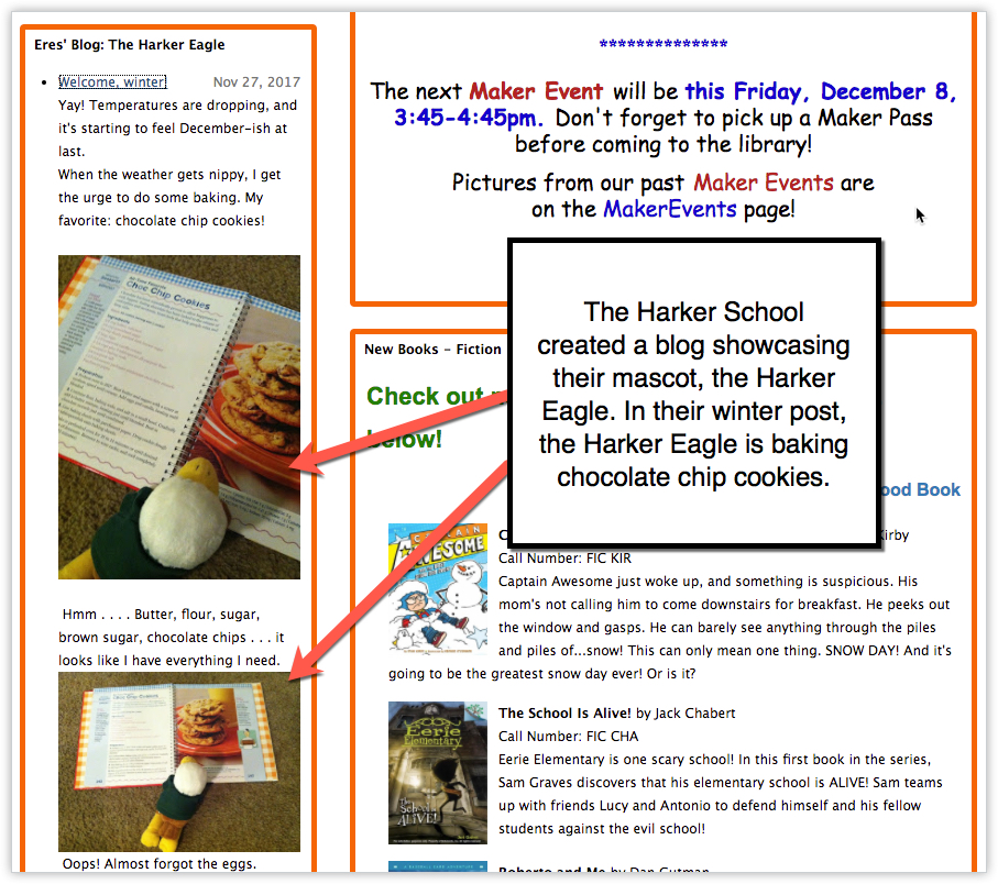
Young children respond to characters and storylines. Creating a rich ‘story’ helps to create a connection between them, your content, and the learning outcomes. Consider using LibGuides blogs to create ongoing blog posts around a library character or story element.
6. HAVE FUN!
Above all, when creating a LibGuide designed for children – have fun with it! Unleash your inner child and think big, bold, bright, engaging, and entertaining.


What are the free tools that you are suggesting to create icons?
Hi Rachel! Canva.com has a ton of free icons in their icon library. You can use them, and then their canva workspace, to alter the images by adding text, changing the colors, etc. If you don’t find anything in the Canva library, Pixabay.com has images as well > just be sure to filter the selection to illustrations. If you find something you like, but you want to modify it, download it and upload it to Canva.com and from there you can add copy over the illustration. Let us know if that helps!
Best,
Talia