
Unlock the Power of Interactive Learning with LibWizard Tutorials
By Kirsten on June 27, 2025

When it comes to library instruction, engagement is everything. That’s why LibWizard Tutorials are built to transform passive information into active learning by empowering your patrons to develop skills, build confidence, and succeed – all at their own pace. Whether you're supporting …
Tales From the Co-Op: June Exchanges
By Hannah on June 24, 2025
Gather 'round for another exciting edition of Tales From the Co-Op! If you haven't caught up with the latest in this series, be sure to check out our May exchanges. Have you had trouble keeping up with incoming questions while your library is understaffed? Would you like to offer patr …
Catch Us in Philadelphia! – ALA 2025, Booth #439
By Kelsey on June 18, 2025
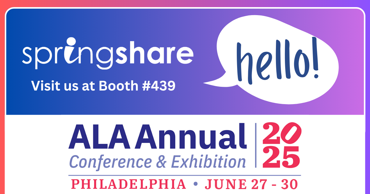
The Springshare team is gearing up for the American Library Association conference next week, and we're thrilled to connect with everyone there! Visit Booth #439 to chat and grab some Springy swag. Make sure to set aside time in your packed conference agenda to attend our flash presen …
Library Badging: Engaging Students with Interactive Tutorials
By Hannah on June 13, 2025

Mark your calendars for our upcoming Learning Lab with guest speakers from the Content Creation team at Southern New Hampshire University (SNHU)! In this webinar, Library Badging: Engaging Students with interactive Tutorials in the Virtual Space on Tuesday, July 15 at 1:30pm ET, you'l …
Chat Smarter: How to Make the Most of Your LibAnswers Chatbot
By Kirsten on June 10, 2025

When your patrons visit your library’s website with a question, the last thing they want is a confusing experience or a dead-end chatbot. That’s why LibAnswers Chatbot is designed differently. This isn’t artificial intelligence – it’s librarian intelligence.
Too Many Shifts, Not Enough Time? Try LibStaffer’s Auto Scheduler
By Kelsey on June 6, 2025

Managing library staff schedules can often feel like solving a complex math equation, with numerous variables such as different departments, diverse positions, varying skill sets, and multiple buildings to consider. This task can be overwhelming, but LibStaffer is here to simplify the …
Shake Up Your Summer with Exciting New Products from Springshare
By Hannah on June 3, 2025

Whether you're catching up on projects between semesters or ramping up for the ultimate Summer Reading Program, you'll want to carve out time in the coming weeks to learn about some exciting new products from Springshare! We're passionate about helping libraries thrive in a digital-fi …
LibCal, LibAnswers, LibGuides, LibInsight, and LibWizard Features Coming Your Way!
By Sarah on May 30, 2025

These releases are on their way to you next week, and will be live in all regions by the end of the day on Friday, June 6, 2025.
Tales From the Co-Op: May Exchanges
By Hannah on May 27, 2025

We are back with the latest edition of Tales From the Co-Op! If you haven't had the chance to read last month's post in this series, be sure to check out our April exchanges. The 24/7 Chat Cooperative is an adaptable service, designed to meet the needs of modern libraries through a ne …
Managing Room Reservations for Libraries of All Sizes
By Kirsten on May 23, 2025
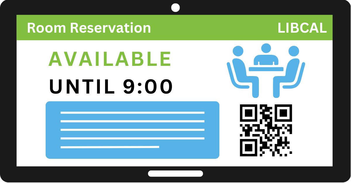
No two libraries are exactly alike. A small community library might have just one meeting room and a study nook. A sprawling academic library might manage dozens of study rooms, presentation spaces, and computer labs across multiple floors—or even multiple campuses. No matter the size …
- Community (59)
- Events (58)
- LibGuides (49)
- LibCal (47)
- LibAnswers (45)
- General (36)
- Product Update (31)
- Conference (25)
- LibGuides CMS (23)
- LibInsight (23)
- LibWizard (22)
- Chatbot (21)
- LibChat (21)
- LibStaffer (21)
- Patron Point (21)
- 24/7 Chat Cooperative (18)
- Tips and Tricks (14)
- SpringyCamp (12)
- Client Stories (10)
- LibMaps (6)
- Partnerships (6)
- Public Libraries (5)
- LibAuth (4)
- Accessibility (3)
- LibConnect (3)
- LibConnect Pro (3)
- LibSites (3)
- CareerShift (2)
- Consulting Services (2)
- Customer Service (2)
- Kudos (2)
- LibPost (2)
- June 2025 (6)
- May 2025 (9)
- April 2025 (9)
- March 2025 (6)
- February 2025 (6)
- January 2025 (7)
- December 2024 (4)
- November 2024 (8)
- October 2024 (6)
- September 2024 (6)
- August 2024 (4)
- July 2024 (7)
- June 2024 (5)
- May 2024 (6)
- April 2024 (7)
- March 2024 (5)
- February 2024 (7)
- January 2024 (6)
- December 2023 (5)
- November 2023 (3)
- October 2023 (5)
- September 2023 (5)
- August 2023 (5)
- July 2023 (4)
- June 2023 (4)
- May 2023 (6)
- April 2023 (4)
- March 2023 (5)
- February 2023 (4)
- January 2023 (4)
