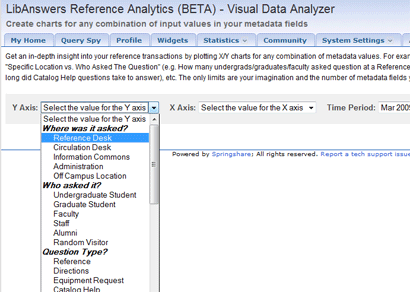
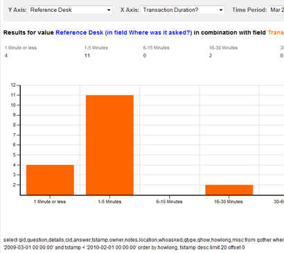
We have a new, incredibly useful, report available for the LibAnswers Analytics module – the Visual Data Analyzer. It enables you to create custom X/Y Charts for any combination of metadata values, for even greater insight into how your reference service *really* works. Yes, you heard it right – now you can pick any two parameters in your reference tracking metadata (i.e. the stuff you decided to track and record for your reference transactions) and get a visual representation of the relationship between them, in real time.
For example, What is the breakdown of patron types who asked their question at the Reference desk? Check. How long did the transactions take at the Circulation desk? Check. For Undergraduate students, what is the distribution of Method for asking the question (live ref, sms, email, chat, etc)? Check. How about for Faculty? Check again. We can go on and on about the endless possibilities for using this cool new reporting tool – the only limits are your imagination and the number of metadata fields you track. Previously, this type of insight was only available to you if you were a master of excel pivot tables and were able to import your reference data into excel and then spend hours messing with the pivot tables every time you waned to see a new angle on your data.
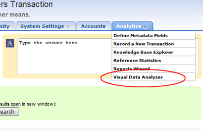
Now, anyone can just log on to LibAnswers Analytics and with few clicks get beautiful charts for any combination of data *in real time*. If you couldn’t tell from the tone of this blog post, we are obviously super-excited about this new Analytics feature. Once you try it out we think you will be too. Simply select the “Visual Data Analyzer” option from the Analytics tab and off you go.
Big thanks to Anthony @ LaTrobe University (our long-time client) for giving us the idea for this feature and helping us implement it. We have the best clients in the world! Keep the good ideas and feature suggestions coming.


